Uncovering Hidden Ordering & Gifting Frustrations
Uncovering Hidden Ordering & Gifting Frustrations
Revealed UX pain points in Freshii’s app, informing design improvements to delivery, customization, pricing, and gift visibility
Revealed UX pain points in Freshii’s app, informing design improvements to delivery, customization, pricing, and gift visibility

Type
School Project
School Project
Timeframe
Mar 2025 - Apr 2025
Mar 2025 - Apr 2025
My Role
UX Researcher & Usability Test Facilitator
UX Researcher & Usability Test Facilitator
Team
4 UX Designers: collaborated on planning, testing, and analysis
4 UX Designers: collaborated on planning, testing, and analysis
Project Overview
Freshii is a dynamic and innovative quick-service restaurant brand committed to providing customers with convenient access to healthy food options. However, after a professional review, we identified critical usability issues that could stop users from reaching their goals. To dive deeper, we conducted usability testing to pinpoint exactly where users were getting stuck and developed strategic solutions to resolve these challenges.
Overview of What We Discovered
Users encountered friction while trying to order a meal or send a gift using the Freshii mobile app.
The delivery and pickup flow was confusing, especially when a “Closing Soon” pop-up redirected users without context.
The customization menu was poorly organized, with missing visuals and unclear steps.
Many users were unaware of extra charges, which caused frustration and led to cart abandonment.
The “Send Gift” feature lacked visibility and clear labeling, causing users to misinterpret it as sending food.
Project Overview
Freshii is a dynamic and innovative quick-service restaurant brand committed to providing customers with convenient access to healthy food options. However, after a professional review, we identified critical usability issues that could stop users from reaching their goals. To dive deeper, we conducted usability testing to pinpoint exactly where users were getting stuck and developed strategic solutions to resolve these challenges.
Overview of What We Discovered
Users encountered friction while trying to order a meal or send a gift using the Freshii mobile app.
The delivery and pickup flow was confusing, especially when a “Closing Soon” pop-up redirected users without context.
The customization menu was poorly organized, with missing visuals and unclear steps.
Many users were unaware of extra charges, which caused frustration and led to cart abandonment.
The “Send Gift” feature lacked visibility and clear labeling, causing users to misinterpret it as sending food.
Chapter 1: The Problem
Freshii is a fast-casual restaurant brand offering healthy meals through its mobile app. To understand how users interact with its core features, we first defined key user goals, such as ordering a meal, sending a gift, and saving money in the Freshii wallet for checkout.
After conducting a heuristic evaluation of these goals, we identified that the most critical usability issues occurred in two areas:
1. Ordering a meal
2. Sending a gift
To validate these findings and uncover additional pain points, we planned and conducted a usability test with real users.
Freshii is a fast-casual restaurant brand offering healthy meals through its mobile app. To understand how users interact with its core features, we first defined key user goals, such as ordering a meal, sending a gift, and saving money in the Freshii wallet for checkout.
After conducting a heuristic evaluation of these goals, we identified that the most critical usability issues occurred in two areas:
1. Ordering a meal
2. Sending a gift
To validate these findings and uncover additional pain points, we planned and conducted a usability test with real users.
What are our usability testing goals?
Observe how users complete key tasks
Uncover pain points in real usage
Provide actionable UX recommendations
What are our usability testing goals?
Observe how users complete key tasks
Uncover pain points in real usage
Provide actionable UX recommendations
Chapter 2: What We Did
We designed a recruitment screener to ensure participants had experience using food delivery apps and matched our target user profile.
All sessions were conducted remotely using the think-aloud method.
We designed a recruitment screener to ensure participants had experience using food delivery apps and matched our target user profile.
All sessions were conducted remotely using the think-aloud method.
Participant Snapshot
Participants were aged 21–40, with a mix of students, professionals, and healthcare workers. All had prior experience with apps like Uber Eats and DoorDash. None had used Freshii's app before.
Participant Snapshot
Participants were aged 21–40, with a mix of students, professionals, and healthcare workers. All had prior experience with apps like Uber Eats and DoorDash. None had used Freshii's app before.
Data Analysis - Affinity Diagramming
To analyze the qualitative data, we used Affinity Diagramming. Each team member recorded insights on individual sticky notes, including direct user quotes and key observations.
We then grouped the notes into clusters/themes, reviewed them collaboratively, and prioritized the key findings (Pernice & Krause, 2024).
Data Analysis - Affinity Diagramming
To analyze the qualitative data, we used Affinity Diagramming. Each team member recorded insights on individual sticky notes, including direct user quotes and key observations.
We then grouped the notes into clusters/themes, reviewed them collaboratively, and prioritized the key findings (Pernice & Krause, 2024).


Chapter 3: What We Discovered
Usability Task Scenarios
Task Performance Summary
Finding #1 - “Closing Soon” Pop-up Disrupted Delivery Flow

Finding
When users attempted to order food near store closing time, the “Closing Soon” pop-up redirected them to the pickup flow. This confused users and led to task failure.
Severity ratings (High, Medium or Low):
🔴 High
When users attempted to order food near store closing time, the “Closing Soon” pop-up redirected them to the pickup flow. This confused users and led to task failure.
Severity ratings (High, Medium or Low):
🔴 High
Recommendation
Allow users to remain on the checkout page and display a clear explanation instead of redirecting.
Allow users to remain on the checkout page and display a clear explanation instead of redirecting.

Finding #2 - Overwhelming Customization Menus

Finding
Participants struggled with unclear categories like “Regular Toppings” vs “Premium Toppings,” pre-selected defaults, and missing images.
Severity ratings (High, Medium or Low):
🔴 High
Participants struggled with unclear categories like “Regular Toppings” vs “Premium Toppings,” pre-selected defaults, and missing images.
Severity ratings (High, Medium or Low):
🔴 High


P4
“Why is there another regular toppings?”
Recommendation
Use clearer labels, reorganize categories, and show all images to reduce friction.
Use clearer labels, reorganize categories, and show all images to reduce friction.
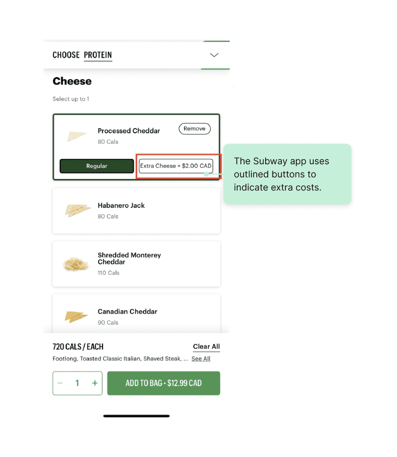
Finding #3 - Lack of Pricing Transparency Caused Cart Abandonment

Finding
Many users were surprised by additional charges during customization. They expected ingredients to be free unless clearly marked.
Severity ratings (High, Medium or Low):
🔴 High
Many users were surprised by additional charges during customization. They expected ingredients to be free unless clearly marked.
Severity ratings (High, Medium or Low):
🔴 High

P5
“Why do they have no price? Nothing is free here!”

P7
P7 would not buy the meal if it was really $40+ for a bowl in reality, feels it is expensive.
Recommendation
Clearly label any extra costs early in the process to prevent surprise.
Clearly label any extra costs early in the process to prevent surprise.
Finding #4 - Gift Feature Was Hidden & Misleading

Finding
Most participants eventually found the “Send Gift” function, but its placement in the hamburger menu and vague wording caused confusion.
Severity ratings (High, Medium or Low):
🟡 Medium
Most participants eventually found the “Send Gift” function, but its placement in the hamburger menu and vague wording caused confusion.
Severity ratings (High, Medium or Low):
🟡 Medium

P6
P6 browsed at promotions on homepage to check gift card.

P3
P3 was unsure what “Send Gift” meant - “Is it a meal? A gift card? Not clear from the wording.”
Recommendation
Clearly label any extra costs early in the process to prevent surprise.
Clearly label any extra costs early in the process to prevent surprise.

Chapter 4: Behind the Scenes - Reflection and Next Steps
Chapter 4: Behind the Scenes - Reflection and Next Steps
What I Faced and Learned
What I Faced and Learned
Through this project, I learned that users don’t always follow the “ideal” flow, some interpreted tasks differently or took unexpected paths, not because they were wrong, but because they saw the task from a different perspective. This reminded me of the importance of approaching usability testing with empathy. What may seem obvious to a designer can be confusing or unclear to a real user. Testing with real people helped reveal gaps between our design intentions and how users actually interact with the product. It also showed me that polished mockups can’t replace real feedback, observing user behavior uncovered insights that static screens alone couldn’t reveal.
Through this project, I learned that users don’t always follow the “ideal” flow, some interpreted tasks differently or took unexpected paths, not because they were wrong, but because they saw the task from a different perspective. This reminded me of the importance of approaching usability testing with empathy. What may seem obvious to a designer can be confusing or unclear to a real user. Testing with real people helped reveal gaps between our design intentions and how users actually interact with the product. It also showed me that polished mockups can’t replace real feedback, observing user behavior uncovered insights that static screens alone couldn’t reveal.
Through this project, I learned that users don’t always follow the “ideal” flow, some interpreted tasks differently or took unexpected paths, not because they were wrong, but because they saw the task from a different perspective. This reminded me of the importance of approaching usability testing with empathy. What may seem obvious to a designer can be confusing or unclear to a real user. Testing with real people helped reveal gaps between our design intentions and how users actually interact with the product. It also showed me that polished mockups can’t replace real feedback, observing user behavior uncovered insights that static screens alone couldn’t reveal.
Next Steps - If I Could Go Further
Next Steps - If I Could Go Further
Based on usability testing findings, I would redesign several parts of the experience.
First, I would improve the “Closing Soon” notification and ordering flow to make it clearer and more actionable.
Second, I would update the ordering interface to show users how many selections they still need to make (e.g., toppings, base), reducing uncertainty during the process.
Lastly, I’d ensure that any extra costs are clearly labeled to avoid confusion or surprise fees during checkout.
Based on usability testing findings, I would redesign several parts of the experience.
First, I would improve the “Closing Soon” notification and ordering flow to make it clearer and more actionable.
Second, I would update the ordering interface to show users how many selections they still need to make (e.g., toppings, base), reducing uncertainty during the process.
Lastly, I’d ensure that any extra costs are clearly labeled to avoid confusion or surprise fees during checkout.

I’m Rowena, a UX designer with 3+ years of experience crafting high-performing websites that elevate products to the next level.
Let's Work Together!
©2026 Rowena Chen. All Rights Reserved.
I’m Rowena, a UX designer with 3+ years of experience crafting high-performing websites that elevate products to the next level.
Let's Work Together!
©2026 Rowena Chen. All Rights Reserved.
I’m Rowena, a UX designer with 3+ years of experience crafting high-performing websites that elevate products to the next level.
Let's Work Together!
©2026 Rowena Chen. All Rights Reserved.

Project
Project